
 Tweet
Tweet
I love the idea of a sublimated back design.. and that looks fantastic. I don't like the front and center logo though.
-
Axel wrote:KeonClark wrote:KeonClark wrote: -
So awesome. I wanted to say something along these lines at some point, but this says it way better than I ever could.TRex wrote: View PostComment
-
Gold is basically the only colour not being used in the NBA by another team ... besides Pink ...

Nevermind.Comment
-
-
I would love those jerseys with just "Toronto" on the frontYou come at the King, you best not miss.Comment
-
-
That's not really a fair comparison. In that graphic, there are only two logos that look really similar, and that's Toronto and Brooklyn. No one has an issue with the logo being a circle. It's the entire look of the logo with the ball and the black border and the lettering.Joey wrote: View PostComment
-
Scraptor wrote: View Post
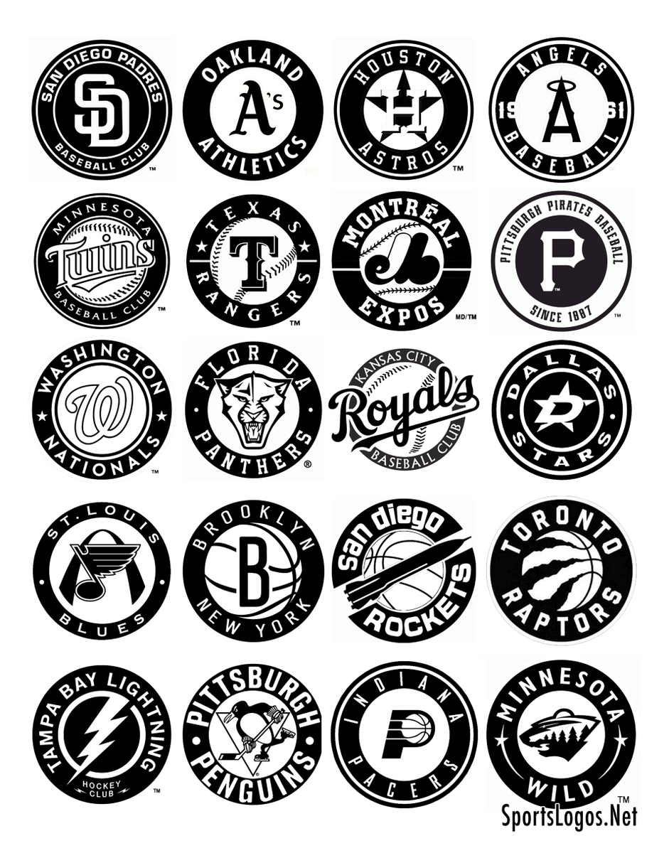
thats just a piss poor critique if the big concern is both used a fucking basketball as part of the logo. the lettering? the typeface could be better, but the way it's laid out is like EVERY OTHER logo on there. its the only way it makes sense to surround a circle.
how could you possibly think that the raptors and nets logos are the only ones that look alike on that list???
pretty much all the logos with baseballs do the exact same thing. same baseball, but with a giant letter (or letters in front of it). rangers. expos. royals.
then there are the ones without using a ball but just use letters in the middle. padres. panthers. nationals. angels. pirates. oakland a's.
these are all clearly extremely similar. if anything, the pacers and brooklyn logo look WAY more similar than the raptors one does. similar thin typeface. same ball. usage of a single letter. black circle. whoop dee do.Comment
-
Like I said, it's the entire look of the logo. The others have distinguishing features or fonts; the only thing that separates ours and Brooklyn is the B and the tearing. Most of the other logos in this graphic dont look anything alike other than that they are circles, save for the Texas Rangers and Expos.iblastoff wrote: View Post
And even if your argument were to hold, what does it say about this logo that is resembles so many other logos? It's simply the most unoriginal, generic design they could have come up with.
I am starting to like the gold version, but the grey version is a clusterfuck. Either way we should have kept the claw as our primary.Comment
-
Minny Wild logo kinda looks like UFO lmaoOnly one thing matters: We The Champs.Comment
-
I believe that your opinion of the logo is being skewed by the poor release.Scraptor wrote: View Post"Bruno?
Heh, if he is in the D-league still in a few years I will be surprised.
He's terrible."
-Superjudge, 7/23
Hope you're wrong.Comment
-
I believe that your opinion of the logo is being skewed by the poor release.Scraptor wrote: View Post"Bruno?
Heh, if he is in the D-league still in a few years I will be surprised.
He's terrible."
-Superjudge, 7/23
Hope you're wrong.Comment
-
The logo is supposed to be a bear and a forest at the same time... which is why it made me laugh when Bryz went there last year. Remember what he said he was scared of?MixxAOR wrote: View PostAxel wrote:KeonClark wrote:KeonClark wrote:Comment
-
Do you mean by the white logo being released first? Because I assure you that's not the case. The grey on black has been derided by pretty much every design person who's weighed in so far. Every poll I've seen, the dislikes outweigh the likes, and I haven't seen any Raptors players rep or speak positively of the new logo.stooley wrote: View Post
If it was just the botched release that was the issue, the reaction wouldn't have been so severely negative. If they had released the grey-on-black first, people might not have made the Brooklyn comparison (which I personally think is the weakest argument against the logo), but they still would have reacted negatively to the logo's colours and general lack of character.Comment
-
the problem with polls is that they reflect what people think, however people are dumb and love a good bandwagonFor still frame photograph of me reading the DeRozan thread please refer to my avatarComment
")


Comment