Announcement

Collapse
No announcement yet.

Raptors 20th Anniversary

Collapse
X
 
  • Filter
  • Time
  • Show
Clear All
new posts

  • iblastoff
    replied
    CalgaryRapsFan wrote: View Post
    With the claw logo bringing the 20 years full circle to the present.

    I like it. Simple, clean, modern take on the 'good old days' of Raptors basketball.

    The only negative comment about the purple/white/black color scheme is that it looks a lot like the Kings' jerseys.
    yah it kind of does. and kings fans have pretty much owned #foreverpurple for a while now

    as for that font, its awful and isn't exactly new or anything so i dunno why people are thinking its something we haven't seen before? its the wordmark they've used for a long time now.
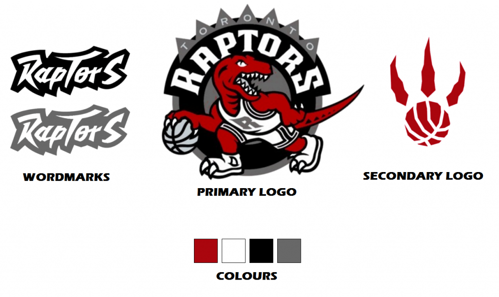


    i expect the new logo to be simplified and modernized.
    Last edited by iblastoff; Tue Mar 4, 2014, 11:47 AM.

    Leave a comment:


  • CalgaryRapsFan
    replied
    Nilanka wrote: View Post
    It could simply be an homage to the past.
    With the claw logo bringing the 20 years full circle to the present.

    I like it. Simple, clean, modern take on the 'good old days' of Raptors basketball.

    The only negative comment about the purple/white/black color scheme is that it looks a lot like the Kings' jerseys.

    Leave a comment:


  • stooley
    replied
    I liked Team Candas Red-Black-Gold jerseys.

    It seems to make sense too.

    Leave a comment:


  • Joey
    replied
    Nilanka wrote: View Post
    Right. It was just a few weeks ago we assumed the OVO promo's black and gold were the new colours.

    Having said that, the black and purple does look good without any red on it.
    Which points more to the fans wanting to see change more than anything.

    I remember when Purple was considered lame, and the Red/Black unis were hot-shit. LOL

    Leave a comment:


  • Nilanka
    replied
    joey_hesketh wrote: View Post
    Since the Text, and images all point back to our Original Logo/Jerseys, and this IS an anniversary tribute, it could be just that; a tribute. Perhaps a throw-back night?
    Right. It was just a few weeks ago we assumed the OVO promo's black and gold were the new colours.

    Having said that, the black and purple does look good without any red on it.

    Leave a comment:


  • Joey
    replied
    Since the Text, and images all point back to our Original Logo/Jerseys, and this IS an anniversary tribute, it could be just that; a tribute. Perhaps a throw-back night?

    Leave a comment:


  • Nilanka
    replied
    It could simply be an homage to the past.

    Leave a comment:


  • Mr.Z
    replied
    gametime wrote: View Post
    In the video they tease it a bit more:
    Where did you find the video?

    Leave a comment:


  • RandomGuy
    replied
    not the fan, reminds me WWE. And they are probably paying thousands to their designers and all they come up with is low quality pictures with free textures, which can be found on google with keyword "grunge textures" on the first pages. But this is my opinion as someone who's not regular in graphics, the most important thing is that majority likes it. I believe that's not the rebranding they are heading to.

    Leave a comment:


  • wallz
    replied
    Love it

    Leave a comment:


  • mike, prague
    replied
    Way cool! I like the colour scheme, the font is a bit weird, but I definitely like it.

    I like the bullet point under why to buy season tickets.

    "Guarantee tickets to all 43 Raptors home games"

    ... speaking in faith.

    Leave a comment:


  • The Great One
    replied
    TorontoRaptors4Eva wrote: View Post
    Is this whats to come? is purple back?

    http://www.nba.com/raptors/20years
    Hope so!! Love the font too! Classic!!

    Leave a comment:


  • gametime
    replied
    In the video they tease it a bit more:

    Leave a comment:


  • JimiCliff
    replied
    That font is hideous.

    Leave a comment:


  • enlightenment
    replied
    purple... I see purple.. I like purple...

    Leave a comment:

Working...
X