godkingleonidas wrote:
View Post
Announcement
Collapse
No announcement yet.
Raptors Rebrand Theory
Collapse
X
-
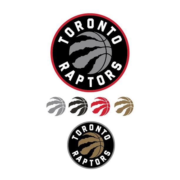
I also petitioned for the Red and Gold, so I'm quite pleased. Curious if they'll keep this one:Cody73 wrote: View PostThis just got tweeted by the Raps:

If that is the new colour scheme, looks like my prediction was true!!!!!!!

or just replacing this one:
 Last edited by Joey; Fri Dec 19, 2014, 07:20 PM.
Comment
-
Why are they messing with the "Claw"?
This is unambiguous and speaks to "menacing" which is what I want the Raptors to be. They can incorporate all the circles and other peripheral shit ...but dont mess with simplicity and clarity.

Comment
-
I mean. Is there any logo out there that is like, artistically complex?LegendaryGringo wrote: View PostAnyone could have made this logo in like a week if they put any effort. Really disappointed
That's not really what logo making is about, I don't think.
I don't think it's about the logo being cool, that doesn't really mean much.
It's about contributing to the team's brand.
All the most iconic logos are that way because of what they represent. It has to take on meaning and be part of a whole.
Expecting the new logo to be awesome and super cool is the wrong approach I think.
and that hat looks SICKLast edited by stooley; Fri Dec 19, 2014, 07:46 PM."Bruno?
Heh, if he is in the D-league still in a few years I will be surprised.
He's terrible."
-Superjudge, 7/23
Hope you're wrong.
Comment
-
Good design isn't about artistic complexity, it's just about having that 'it' factor. That's why I like the Nets re-brand - simple, but very strong, and obviously the work of skilled professionals.stooley wrote: View PostI mean. Is there any logo out there that is like, artistically complex?
That's not really what logo making is about, I don't think.
I don't think it's about the logo being cool, that doesn't really mean much.
It's amount contributing to the team's brand.
All the most iconic logos are that way because of what they represent. It has to take on meaning and be part of a whole.
Expecting the new logo to be awesome and super cool is the wrong approach I think.
and that hat looks SICK"Stop eating your sushi."
"I do actually have a pair of Uggs."
"I've had three cups of green tea tonight. I'm wired. I'm absolutely wired."
- Jack Armstrong
Comment
-
Doesn't matter where you go.... everyone either likes it or hates it.Axel wrote:Now Cody can stop posting about this guy and we have a poster to blame if anything goes wrong!!KeonClark wrote:We won't hear back from him. He dissapears into thin air and reappears when you least expect it. Ten is an enigma. Ten is a legend. Ten for the motherfucking win.KeonClark wrote:I can't wait until the playoffs start.
Until then, opinions are like assholes. Everyone has one and they most often stink
Comment
-
I dunno, the Nets unis are a little boring to me. And their mascot was brutal. I like this logo. We'll see.JimiCliff wrote: View PostGood design isn't about artistic complexity, it's just about having that 'it' factor. That's why I like the Nets re-brand - simple, but very strong, and obviously the work of skilled professionals."Bruno?
Heh, if he is in the D-league still in a few years I will be surprised.
He's terrible."
-Superjudge, 7/23
Hope you're wrong.
Comment


Comment