I know right :/ The draft/FA excitement is over and we've got a long way to go. I heard pounding back 40's really helps pass the time. Wake up and it's October.
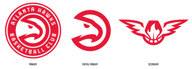
That's still just the primary logo and the partial primary. The Primary, Secondary, and Tertiary logos are wholly different, not just a different color scheme. Check out these links and you'll see what the NBA requires for teams making new logos. It's 3 distinct logos and 2 partials.
Now Cody can stop posting about this guy and we have a poster to blame if anything goes wrong!!
KeonClark wrote:
We won't hear back from him. He dissapears into thin air and reappears when you least expect it. Ten is an enigma. Ten is a legend. Ten for the motherfucking win.
KeonClark wrote:
I can't wait until the playoffs start.
Until then, opinions are like assholes. Everyone has one and they most often stink
The Hawks released their primary and secondary:
Pretty sure the stylized "ATL" on their new alternate jerseys qualifies as a 3rd logo since they're using it by itself on merchandise, whereas they couldn't just sell a red shirt that says Atlanta and have it be associated with the team.
The Clippers only have two different logos, but they broke up the primary into two partials instead of one.
Primary:
Secondary:
Partial1:
Partial2:
At worst we're getting another distinct logo and another partial. We've only seen our primary and the partial primary. I'd guess the rest of the logos will be revealed with the Jerseys since that's where they're used (on the jerseys).
"The silver lining in the Clippers wordmark alludes to the renewed collective optimism of Clippers nation."
My first response was mockery. Then I thought about how much they must have been paid to come up with that hackneyed bullshit.
Last edited by JimiCliff; Thu Jul 16, 2015, 03:54 PM.
"Stop eating your sushi."
"I do actually have a pair of Uggs."
"I've had three cups of green tea tonight. I'm wired. I'm absolutely wired."
- Jack Armstrong
"The silver lining in the Clippers alludes to the renewed collective optimism of Clippers nation."
My first response was mockery. Then I thought about how much they must have been paid to come up with that hackneyed bullshit.
Bahaha. I love the bit about the blue line being the ocean's horizon. Which means the red line below it represents hell, a concept Clippers fans are quite familiar with. Lots of hell.
Those jerseys look the same as the old ones except for the font.
Yeah... Which isn't bad or good imo, but why not just leave things the way they were? If you really needed a basketball in the main logo, you could always do the claw logo (that was our half court for a while) or the one with the Dino bouncing one
A key that opens many locks is a master key, but a lock that gets open by many keys is just a shitty lock
"Stop eating your sushi."
"I do actually have a pair of Uggs."
"I've had three cups of green tea tonight. I'm wired. I'm absolutely wired."
- Jack Armstrong
What's on the left side of the shorts facing us? The right side is the logo but they wouldn't have put the logo twice, right?
It seems to be the same logo.
However, there's something new on the waistband, ala Hawks.....
Axel wrote:
Now Cody can stop posting about this guy and we have a poster to blame if anything goes wrong!!
KeonClark wrote:
We won't hear back from him. He dissapears into thin air and reappears when you least expect it. Ten is an enigma. Ten is a legend. Ten for the motherfucking win.
KeonClark wrote:
I can't wait until the playoffs start.
Until then, opinions are like assholes. Everyone has one and they most often stink
 Tweet
Tweet

Comment