I like and dislike their design. First off, I hate the lone "B" in the middle of the ball. It's just floating there and very boring, would prefer just the ball. Speaking of which, isn't the ball image just a little played out? I like the overall simplicity and think it works on some levels yet leaves me wanting something more. To me it looks like something that came out of a first year design exercise where you get a limited amount of time to come up with 5 proposals.
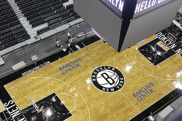
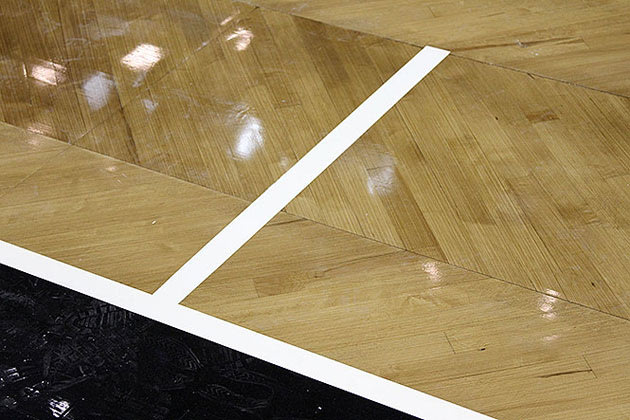
As for the court I love the Herringbone hardwood, it looks great. But just like the logo design the stadium looks a little boring, cold and unimaginative. That much black/grey is just visually unstimulating and kinda "m'eh". Even the spurs mix it up with a little more colour and life by leaving the key "clear" and not relying on grey (even if they call it "silver") so much.
Maybe it'll look better when it's all said and done and fans are in the stands. Right now, IMO, it's just kinda boring. There are plenty of examples of colour use gone awry in the NBA, even with our beloved Raptors, but this is just the opposite.
I like the designs and colours and their link to "tradition" of the old New York subway signs and logos. The faux tradition is ironic in the sense that this is the very first year for the team in Brooklyn and the Nets franchise has not had much success over the years, though they did make it to the NBA finals in consecutive years and those two ABA titles back in New York in the day. Anything with the stamp "New Jersey" is usually not inspiring.
Its really weird when you think of it.. it's like those gloves that leave your fingers exposed, only on a raptors feet. It makes you think, what the hell were they thinking when they drew this up? I still love it, however
 Tweet
Tweet


Comment